
As a part of the Measurement Framework API, the Measurement Framework Visualization (MFVis) class enables experimenters to visualize measurement graphs inside JupyterHub. The library provides a GUI where experimenters can select the name of the dashboard, the node they are interested in, the type of graphs they want to view, the time period in which the graph data is collected and the node interface name if the dashboard has panels about node interfaces. Utilizing the embedding functionality, the library calculates the URL of the graph (stored on the Grafana server on the measurement node) based on the values selected by the user in the GUI and displays the graph in the JupyterHub output cell. Besides using the GUI to visualize graphs, experimenters can also make API calls to download measurement graphs as .png files.
Prerequisite
- To use the MFVis class, experimenters must have successfully instrumentized their slices using the Measurement Framework Library (MFLib)
- Experimenters have to make sure that the browser they use to run the JupyterHub (or local Jupyter Notebooks) has access to the Grafana server on the measurement node
- The code works with ipywidgets version 8.01
Accessing the Grafana Server
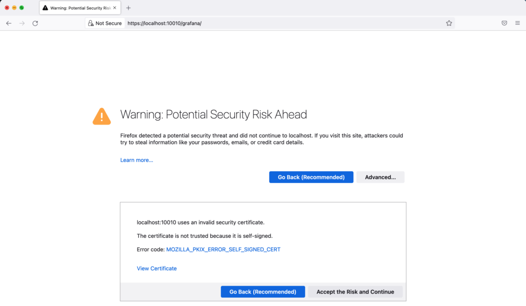
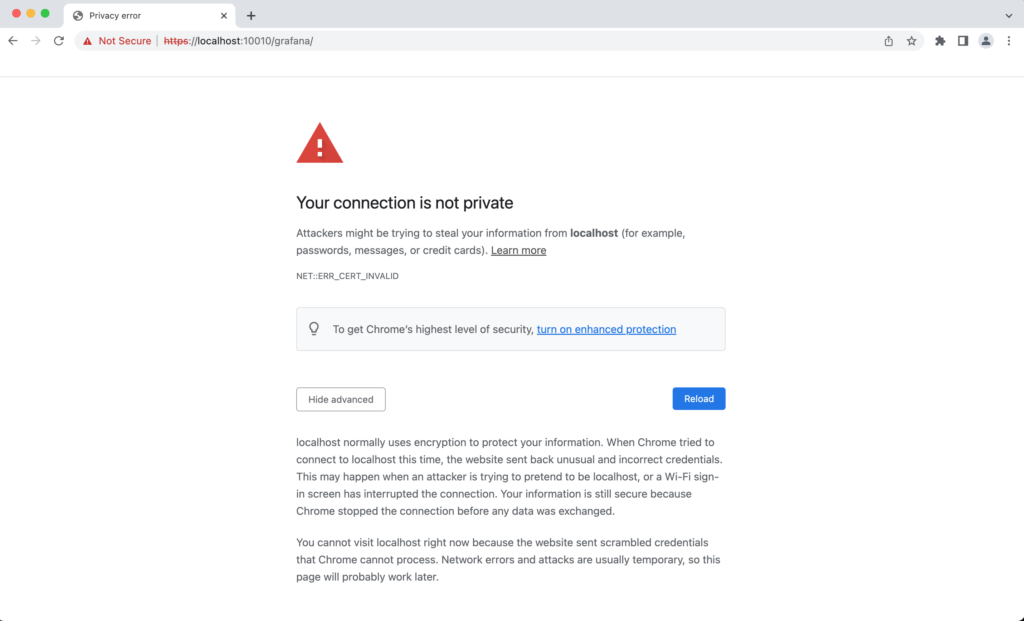
The Grafana server installed on the measurement node uses a self-signed certificate. To access the Grafana server, do the following:
- Due to the existence of the bashion host, experimenters can set up SSH tunnel to access the measurement node using the following command:
ssh -L 10010:localhost:443 -F <fabric-ssh-config-file> -i <your portal_slice_id_rsa-file> <slice-username>@<meas_node-ip>- Then go to https://localhost:10010/grafana
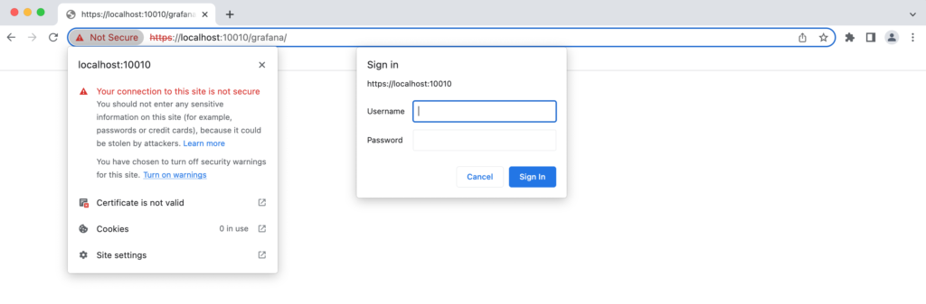
- Different browsers on different operating systems may show different warnings for the site with a self-signed certificate. Experimenters can expand the “advanced” button and then click the “Accept the Risk and Continue” button to proceed (if they find this option). If the option is not available, experimenters need to accept the certificate by manually adding it.
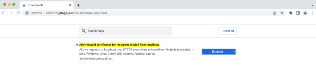
- Tips for accessing the Grafana Server using Google Chrome on MacOS: Experimenters can pick one of the approaches listed below if they do not see the option to proceed under the “advanced” button: (1) Add the certificate manually to the Keychain Access. (2) Change the settings of Chrome by typing “chrome://flags/#allow-insecure-localhost” in the address bar and enable “Allow invalid certificates for resources loaded from localhost.” Then refresh the page. (3) Type “thisisunsafe” anywhere on the warning page (note: the process is invisible) to bypass the invalid certificate warning and revert it by clicking the padlock icon and then “Turn on warnings”.
How to Use to Code
After satisfying the prerequisite, experimenters can use Measurement Framework Visualization (mfvis) to either visualize graphs inside Jupyter Notebooks or download graphs as .png files.
- Import the code
# If you installed the mfvis branch you can use:
from fabrictestbed_extensions.mflib.mfvis import mfvis
# If you are using a local copy of the mfvis.py file use:
#from mfvis import mfvis- Create an instance of the class
slice_name= YOUR SLICE NAME
mfv = mfvis(slice_name)
- Call the API to display the GUI
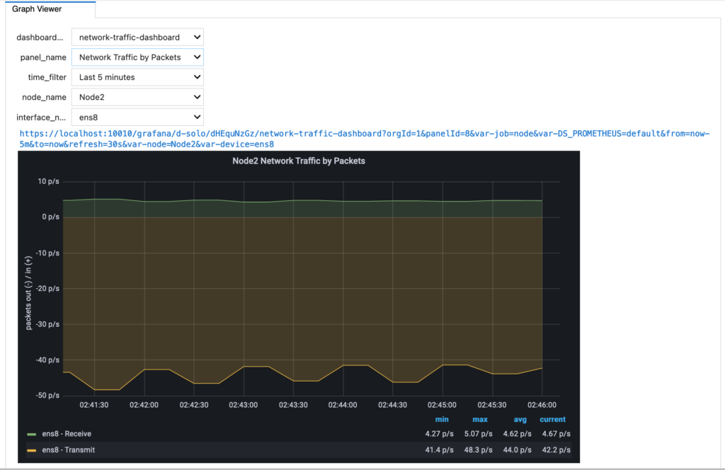
mfv.visualize_live_prometheus()The GUI provides a list of dropdown menus for experimenters to select values for various fields. Once experimenters change values in all the fields, the GUI will calculate the URL of the graph based on the selection of the experimenters and pop up the graph in the Jupyter Notebook output cell.
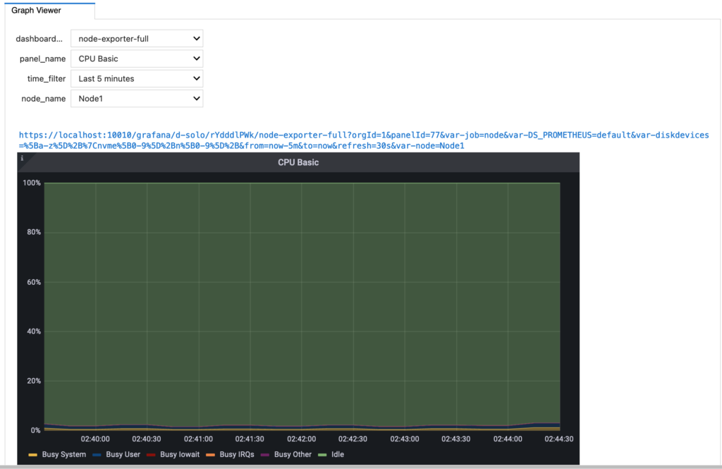
The GUI is dynamic as it displays additional dropdown menus based on the dashboard selected by the experimenters. For example, the “node-exporter-full” dashboard comes with panel_name, time_filter and node_name while for the “network-traffic-dashboard”, the GUI displays an additional dropdown menu called “interface_name” that allows the experimenters to inspect measurement graphs for a specific interface of the selected node in the slice.
Download measurement graphs as .png files
1. The arguments that must be specified include dashboard_name, panel_name, time_filter and node_name.
2. Whether the interface_name should be specified is based on dashboard_name. Currently, only ‘network-traffic-dashboard’ requires interface_name.
3. file_name and timezone are the optional arguments. The file_name argument allows the users to define the name of the downloaded .png file. The timezone argument allows the users to view and download the graph image with time series in their time zone.
4. Default file download location is slice storage; Default graph time: UTC
- Collect information that may be used
# Available dashboard names, time filters and node names
print ("Available dashboards: "+str(mfv.get_dashboard_names()))
print ("Available time: "+ str(mfv.get_available_time_filter_names()))
print ("Available nodes: "+ str(mfv.get_available_node_names()))

# Available panel names that are tied to the dashboard name
dashboard='network-traffic-dashboard'
print (mfv.get_panel_names(dashboard))- Specify arguments for the download call
dashboard='network-traffic-dashboard'
panel='Network Traffic by Packets'
time='Last 15 minutes'
node='Node1'

# Interface names depend on the selected node name. See available ones
print(mfv.get_interface_names(node))

# Specify interface names based on the result
interface='ens7'

# File name is optional. Default is the storage directory of the slice
file_path="/home/fabric/work/test.png"

# Find device time zone information
from IPython.display import Javascript
Javascript("element.append(Intl.DateTimeFormat().resolvedOptions().timeZone);")

# Time zone is optional. Default time series in graphs use UTC
timezone='America/New_York'
- Call the API to download the graph as a .png file
# Use the default file name, default UTC time series
mfv.download_graph(dashboard, panel, time, node, interface_name=interface)

# Add the optional file name and timezone
mfv.download_graph(dashboard, panel, time, node,   interface_name=interface, save_as_filename=file_path, time_zone=timezone)
Methods
-visualize_live_prometheus()
- Creates an interactive GUI using ipywidgets
- Appends the values of the widgets selected by the user (e.g, graph name, time filter, node name, interface name) to the basic URL generated when creating the mfvis object.
- Formulates the final URL of the graph and displays it in the output cell of the Jupyter notebook
–download_graph(dashboard, panel, time, node, interface_name=interface, save_as_filename=file_path, time_zone=timezone)
- Calculates the renderer URL based on the arguments provided in the call
- Uses grafana_manager to download content from the renderer URL
- Writes the content to the specified file
-render_graph_url(dashboard, panel, time, node, interface_name=interface, save_as_filename=file_path, time_zone=timezone)
- Prints out the rendering URL of the graph based on the input arguments